My logo for my production company took alot of development. I experimented with alot of different shapes and designs and looked at alot of other production company logo's to draw inspiration for my own.
I noticed that some logos, have animals, or nature references in their logos.
 |
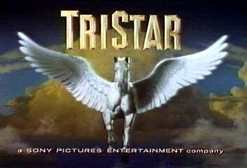
Tristar has a horse in their logo.
|
I dew inspiration from that, for the tree in the middle of my logo. Another connatation of the tree would be, that our production company is constantly growing and trying to get to new heights with its film production.
I also noticed that alot of film logo's were either circular in shape, or square. I used this inspiration to make my logo a circle.
 |
| Warner Brothers logo is circular in shape. |
My logo is a circle with a tree inside, the background of the circle is clouds, used in alot of logo's to connatate that film, have a dream like quality with them, and when you are watching them your head is in the clouds.
 |
| The Dreamworks image also features clouds. |
I think my logo is a typical film logo. I wanted it to show that my movies would have an escapism element to them, and by including a tree, it would symbolize the growth and development of new ideas and breaking the codes and conventions of film, to make fresh and exciting pictures.

No comments:
Post a Comment